
Top Tips On Understanding Composition
/
top tips on understanding compositon
For Instagram Photographers, Influencers, Artists and Small Businesses
A series of tips intended for Instagram photographers, influencers, artists and small businesses.
Have you ever wondered why some images capture and hold our attention seconds in a row, while others - make us swipe away in a hurry and are instantly forgotten? I believe the answer lies in composition. Composition is a division of space and a way of arranging elements in a scene in a pleasing way. Images that do well on Instagram are well balanced and naturally beautiful, memorable and relatable. Great images pull us in, lead us around the frame, while letting us pause and inspect multiple points of interest. They tell a story we can relate to, and thus are more engaging.
However, compositions that look natural and effortless take a lot of thought and skill. All of this takes a lot of hard work and practice, but can be learned. My goal here is to highlight the key elements, make them more understandable, and easy to use to effectively improve your photography. I plan to go in depth on each topic in subsequent posts.
Here is my take on composition with memory clues that are easy to recall:
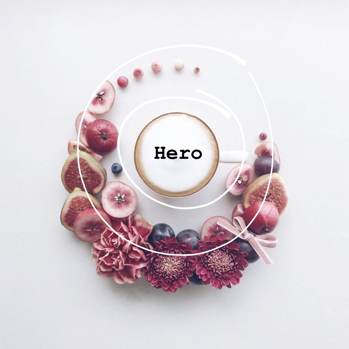
1. ‘I NEED A HERO’ - focus of interest
What is a Hero in a composition?
A hero is the primary subject or the main interest - the focal point of a composition. It's what we are immediately drawn to upon seeing an image - Eyes, faces, people (figures and body parts) and animals are natural eye-catchers and thus make great heroes!
Why is a Hero essential in a good compostion?
There is no story without a hero. If the focal point is missing, we don’t know what the story is about - the viewer is bored and the image is instantly forgotten what was i suppose to remember?). If an image has too many focal points, they are competing for viewers attention and send the eye to bounce around the frame without giving it a place to rest or focus on - it’s too distracting, too chaotic, too tiring.
How to define a Hero and make it stand out?
Decide on the main point of interest and build your image around it. Simplify and declutter the scene - remove the distractions (those things that compete for attention with your hero). To make a subject stand out use contrast (light subject agains dark background or vice versa), saturation, depth of field (use larger aperture) or motion. Some similar camera tricks are used by movie makers, where everything else is blurred - you're only allowed to see the image they want you to focus on!

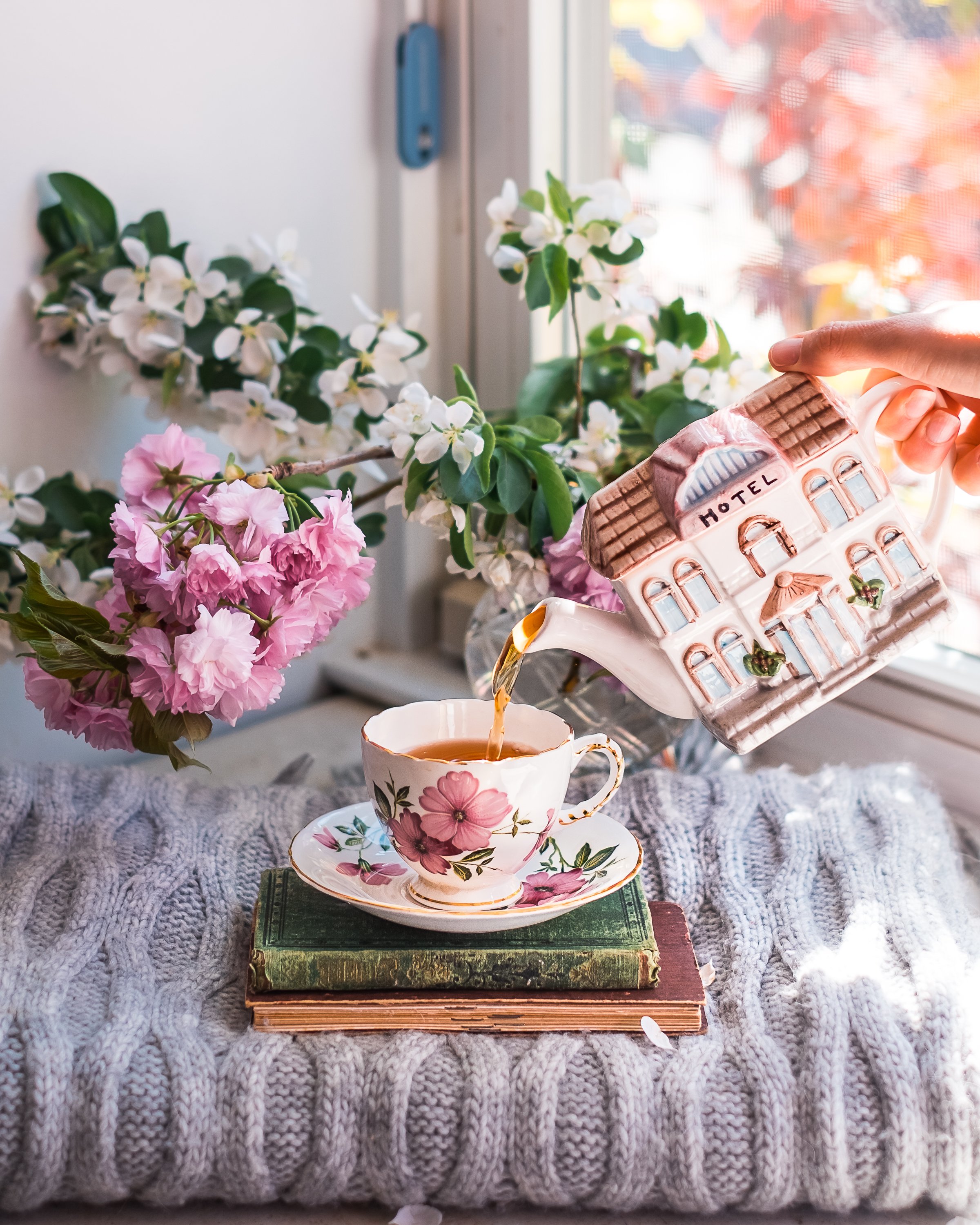
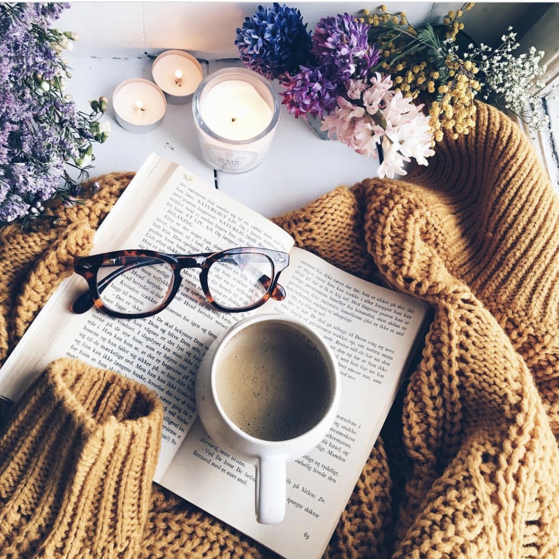
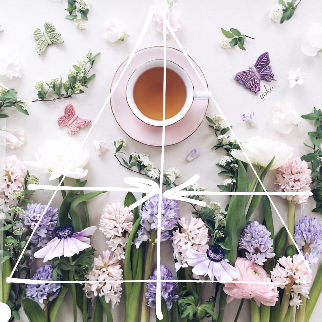
the story of tea time
HERO: My cup is a Hero (a primary subject, and, in this case, a fragrant pick-me-up for me) in this composition.
FOCUS: It is in focus, in the center (on a pedestal) of the image.
CONTRAST: It's light in relation to the book it's standing on and has a dark outline that contrasts with the light background wall.
LEADING LINES: The arrows indicate leading lines pointing towards the focal point.
STORY: There are no competing elements. Teapot, flowers and the cup all work in harmony with each other and are part of the story set up by a cozy window.
BONUS TIP: hand in frame adds a human element to the scene thus making it more pleasing and natural
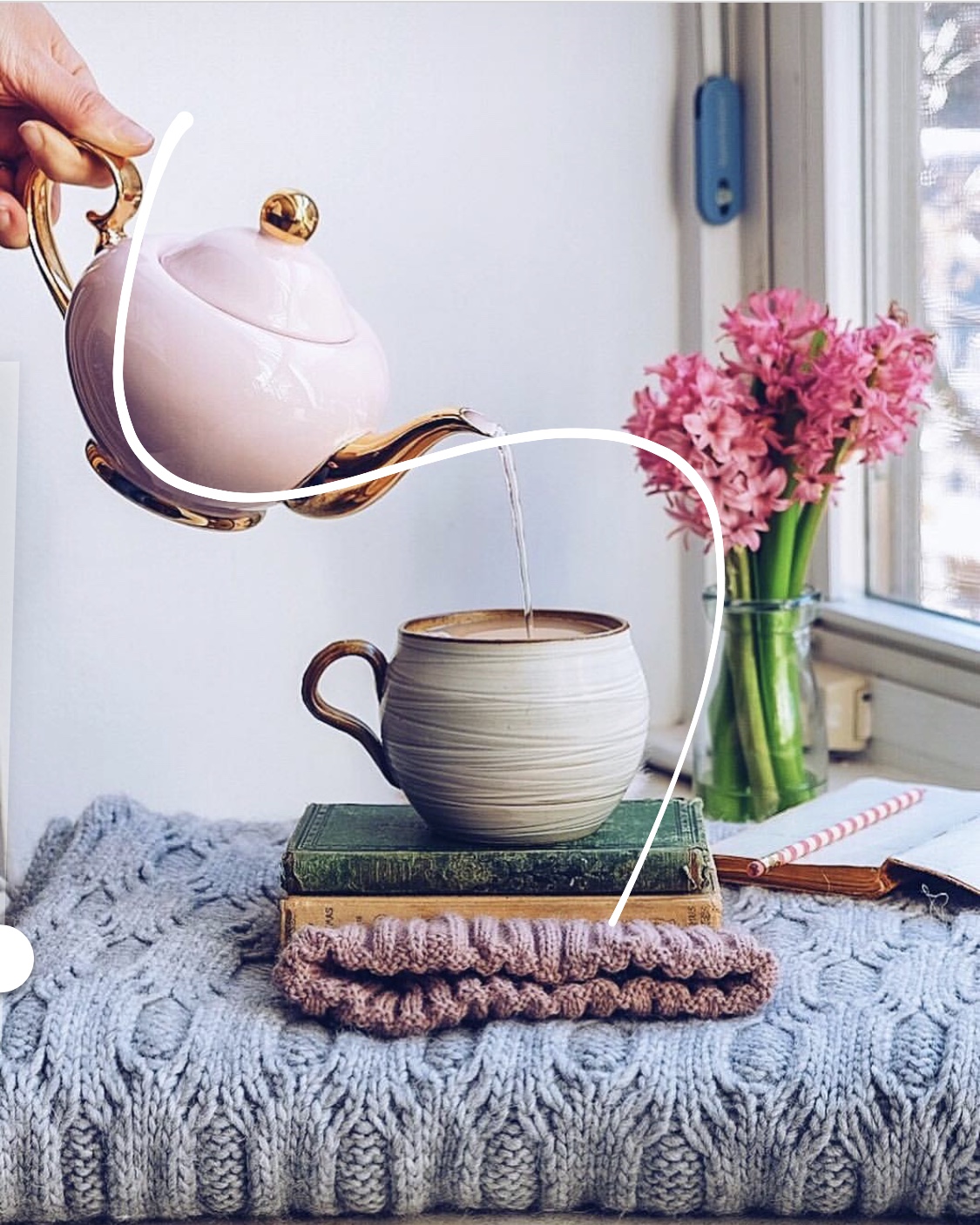
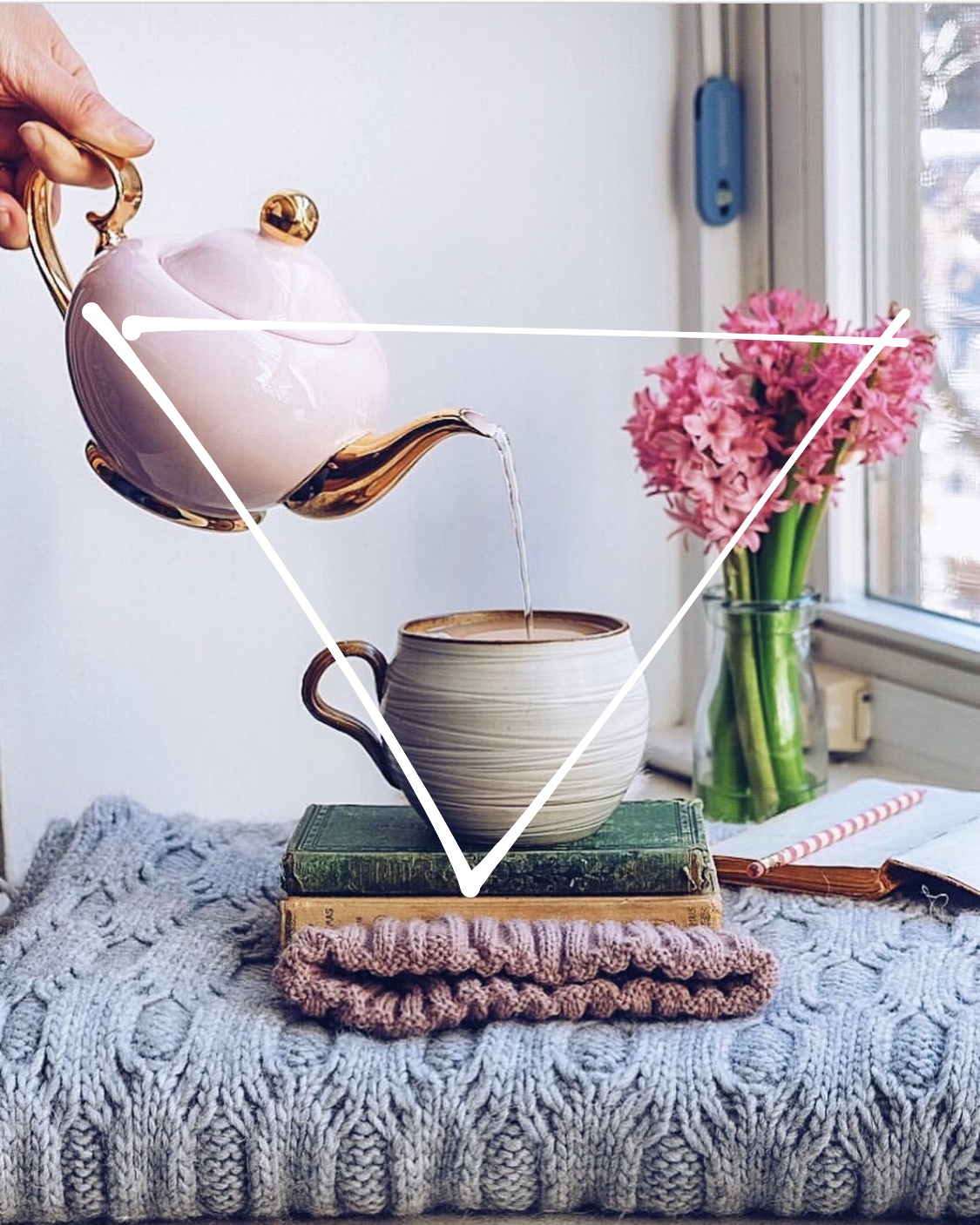
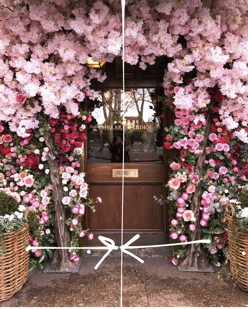
2. ‘SHAPE THAT THING’ - Geometry and how to use it in composition
What geometrical figures/elements to use for better compositions?
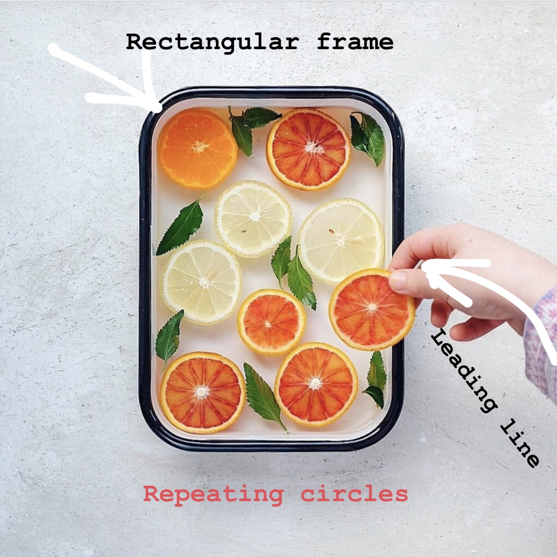
Triangles, Diagonals, Arcs, S-curves, Circles, Squares and Rectangles.
Why use geometry to improve composition?
Geometrical elements can lead the viewer to the main subject (leading lines) or frame it to make it shine (framing elements). They help make picture more interesting, dynamic, and tie different elements together.
How to effectively use geometry to improve composition?
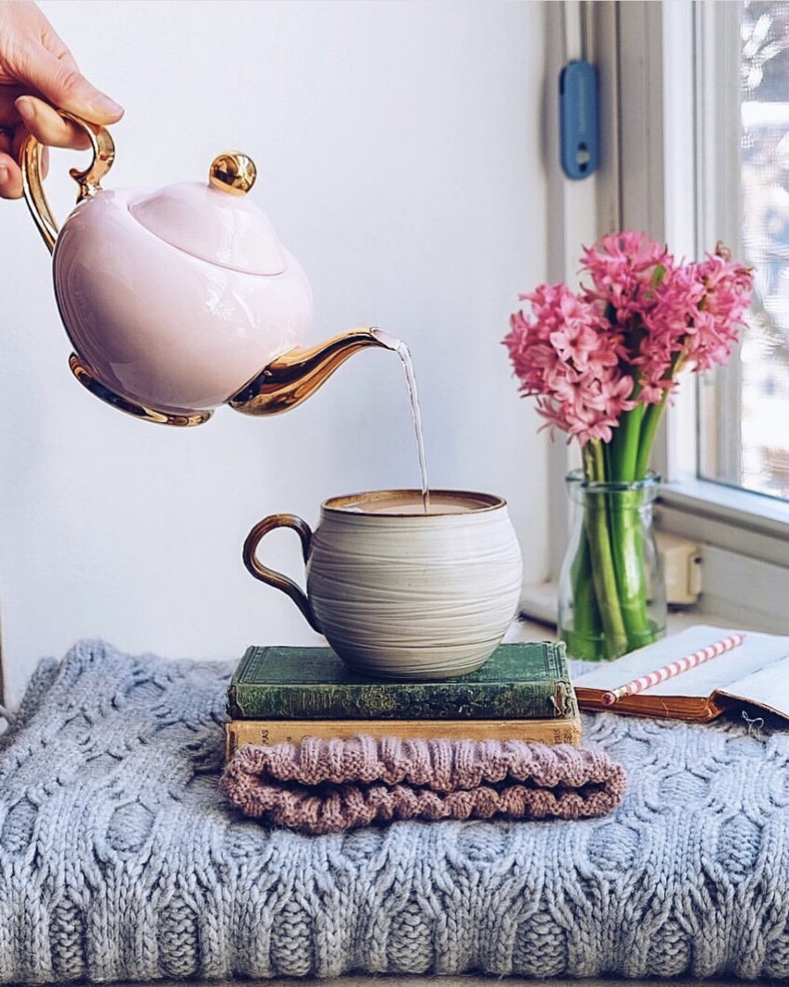
Triangles, Diagonals, Arcs, S-curves not to restrict, but rather to help pull the picture together and draw the path for the eyes to travel along. Think "S" for sexy and for signals for the eyes, some experts have called it the "compositional gold" - Circles, squares and rectangles are most effective in framing the subject (think cups for coffee/tea; trays to hold a meal, cups or accessories; notebooks and flat-lay cards to write messages on), triangles for a special symmetry. Read more on this here.
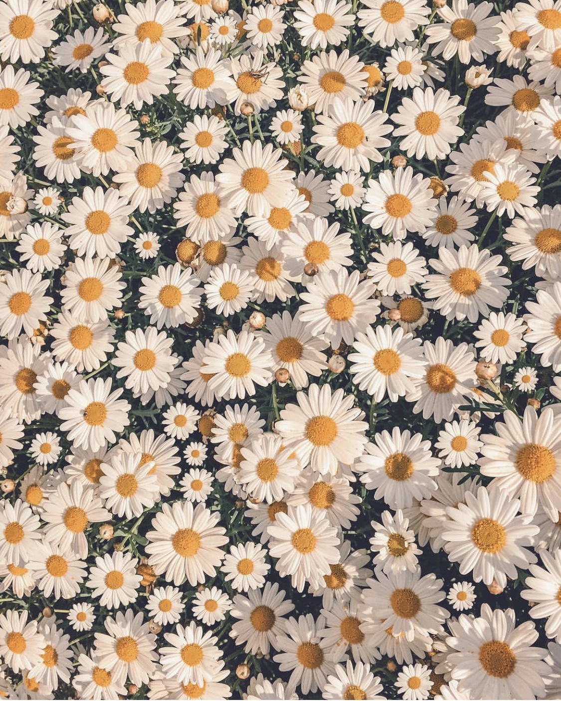
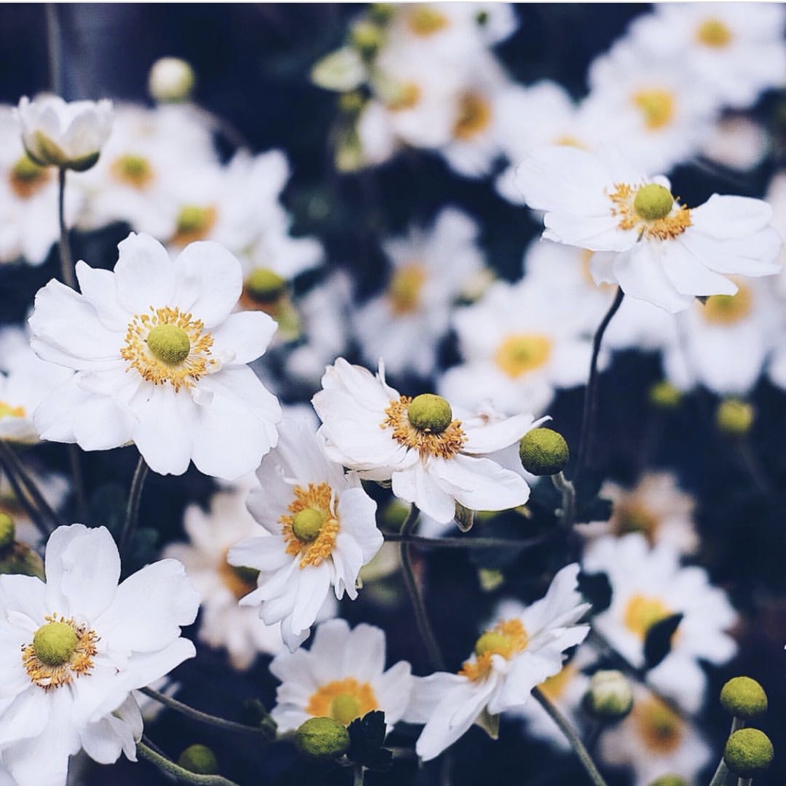
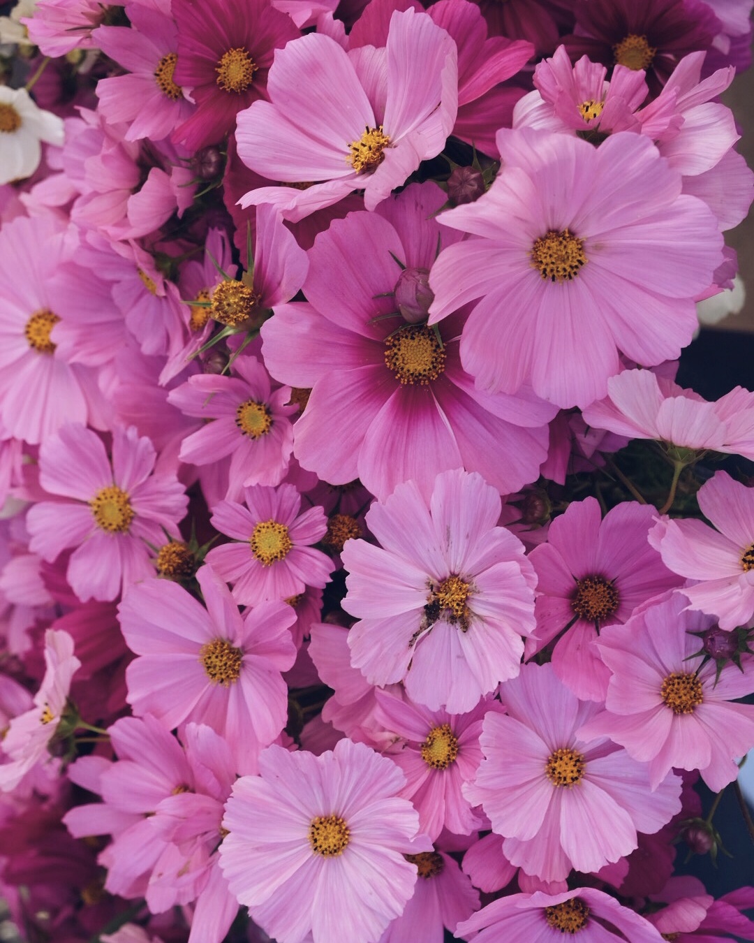
Circles, squares and rectangles are most effective in framing the subject - see what you think of these ...
3. 'RULE YOUR WORLD' - simple rules and tools to improve compositional structure of an image
What are the major rules in composition?
The "Rule of Thirds" - simply dividing the space into thirds, and then concentrating your efforts on the intersection points, and the axes - i've seen this rule of thirds expressed many times by different artists, and recommend you look at the multiple ways in which it's been expressed to find the one that resonates with you best. Please also look at the "Golden Ratio"; "Pyramid composition", "Symmetry" and "Full Frame" for further expansion on this important concept.
Why are these rules useful in improving the composition?
The above rules are simple suggestions that are proven to work. They help you decide where to put the subject, make you think about dividing the rest of the space and balancing the image you are about to capture or style. They help add structure to your composition and thus are very useful to keep in mind when composing. They don't have to be precisely applied and are fun to experiment with.
How to effectively use compositional rules?
The rules are useful in subject positioning and division of space - try it, experiment, and see what you like!.
Golden Ratio is a mathematical division of space found in nature and works exceptionally well in photography and art. You can read more about it here .

Rule of thirds
RoT is a simplified version of the Golden Ratio and can be visualized as a tic-tac-toe or a hashtag grid (#) applied to an image.
It's about dividing an image into thirds along horizontal and vertical axis (with 2 vertical and 2 horizontal lines) and composing it around the resulting 9 areas and 4 intersections.
Important elements of the compositions should be placed on the intersections and along the axis As a good rule of thumb, put your subject near an intersection, and horizon in a landscape (or table in a still life interior design setting) near a lower horizontal line.
Pyramid Composition is based on a pyramid (hello triangle) within an image. It is great for composing still life and interior design scenes.
Symmetry is a simple, yet very successful principle used in architecture, often together with a pyramid composition. It makes for a well balanced composition from the start as it involves mirroring a subject along a vertical (or horizontal axis).
Full Frame is when a single subject (face) or a great number of similar interests (flowers from above) fill the entire frame. It's the simplest composition that does not require an individual Hero since it's full of them!.
Hope you found these tips helpful and are inspired to use them in your compositions. Put them in your toolbox and use them on their own or in combination with each other. Mix and match and be brave and daring - play around and have fun. Do your best to balance your image (a squint test will help to see if the the visual weight of the picture is evenly distributed). And remember, everybody can learn to compose and improve their photography, the key is always to practice, be curious and never stop experimenting.